In any remodel, no matter what the size of the project, there is an incredible amount of detail to pay attention to which results in sleepless nights, hours of research, and contemplation. As a designer, I am often called into a project at the very start, but at times I’m called in midway or later. When I’m not brought in at the start, I always try to catch any mistakes that may have occurred prior to moving forward on the project. Often, there are two main areas where I see mistakes — which we inevitably fix but sometimes with a hefty price tag — that could have been avoided. These two areas go hand in hand, so there really are two corrections to be made.
The first big mistake is: NOT thinking through your space plan or even making one.
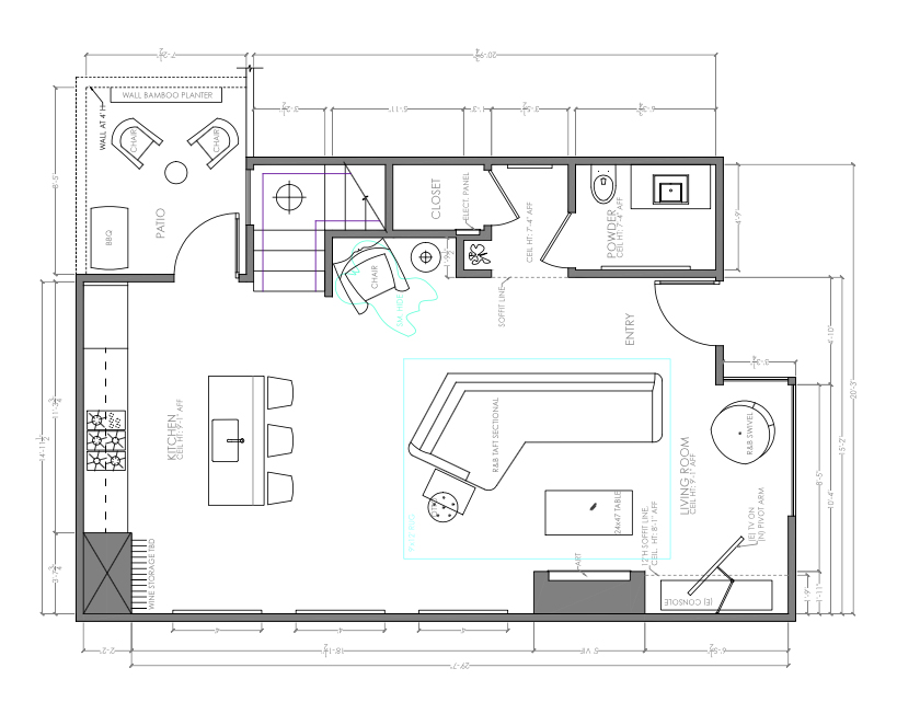
I can’t tell you how many times I’ve joined a client midway through a remodel only to learn that furniture hasn’t been given much thought. They are wrapped up in the roofing materials, where walls will be, the new bathroom tile, etc. It is understandable, but furniture deserves attention and creating a space plan is critical. Prior to starting a remodel, ask yourself if you plan to change the overall style of your interior? If so, make a list of furnishings that you plan to keep {that fit within your desired style} as well as furnishings that will need to be fabricated or purchased, including artwork. With the dimensions of the furnishings and the home, create a space plan that is well thought out.
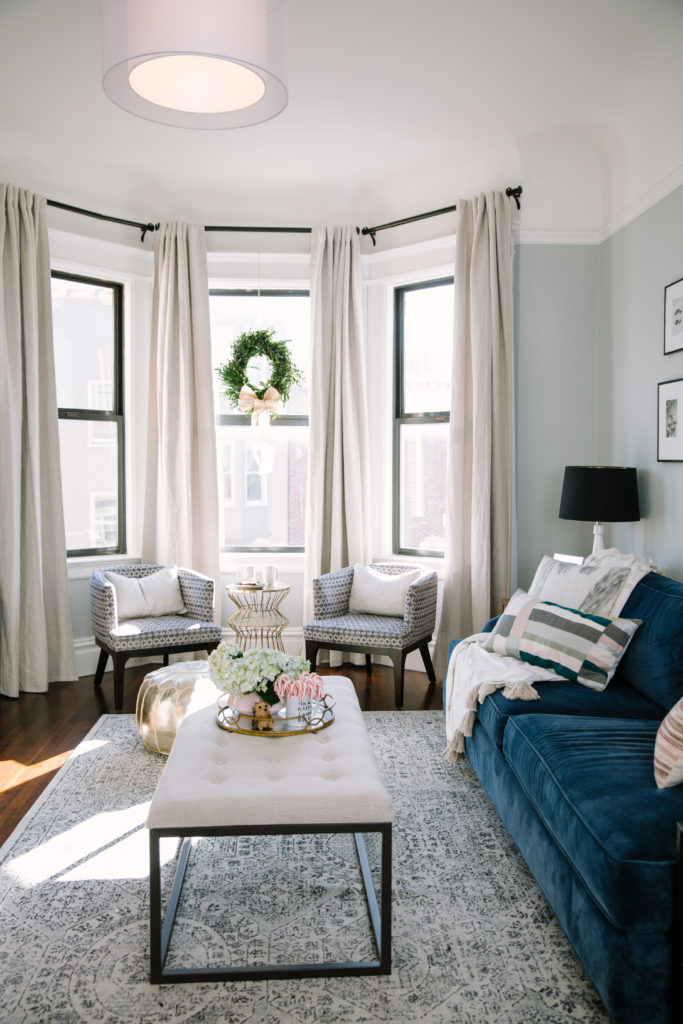
For example, that big comfy chair that you love — and lounge in day after day with coffee and a book — will that will remain in the home when the remodel is complete? Go through a series of questions such as, how will the size of the chair feel in a room next to the proposed sofa or cabinet; does it need to be reupholstered to fit with your new color story of the home; is there room for a small table next to it to place a coffee cup on, etc? Like I said, there are a lot of details and questions to ask yourself, and the earlier on you do this the better. As you create your space plan, visually walk through the home. When you enter, is there a spot to put your belongings? What art will be in the space? As you walk throughout, ask more appropriate questions. Is there enough room allocated between the coffee table and the sofa? Is my antique chest in the best location in the middle of the living room? By visually walking through each step of the home you will catch multiple errors that you may not have seen before.
Need help creating a space plan or overall design for your home? Let Julia Goodwin Design help you, contact us here & see Julia Goodwin Design’s portfolio here.
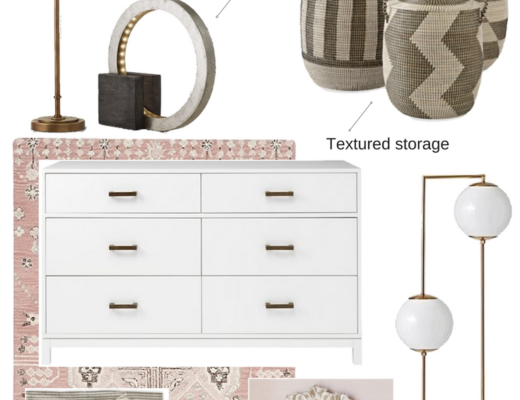
Shop Julia’s Favorite Lighting
The second big mistake is: NOT thinking through your electrical plan.
Recently, I viewed quite a few electrical plans for clients and noticed a lapse of attention when it came to electrical outlets and overhead lighting. While there are electrical codes one must comply with, that doesn’t mean there aren’t options that require your consideration. While your architect is likely in the dark {pun intended} about your furnishings, these go hand in hand with your space plan. Let’s take a look at a bedroom for example: the architect might put in an outlet behind the bed; if it is a shared bed, wouldn’t you prefer two outlets so both of you can plug in necessary devices? Switches; do you want a switch above the nightstands on both sides of the bed to control overhead lights or pendants/sconces? If so, you will also want to pay attention to the height of the nightstand for that room — again, a space plan is critical. Let’s not forget overhead lighting; you will want to make sure you have enough overhead lighting for your needs, and I always recommend putting them on a dimmer where possible. When relaxing in the evening, you most likely won’t want the brightest light. Besides, who doesn’t want options?
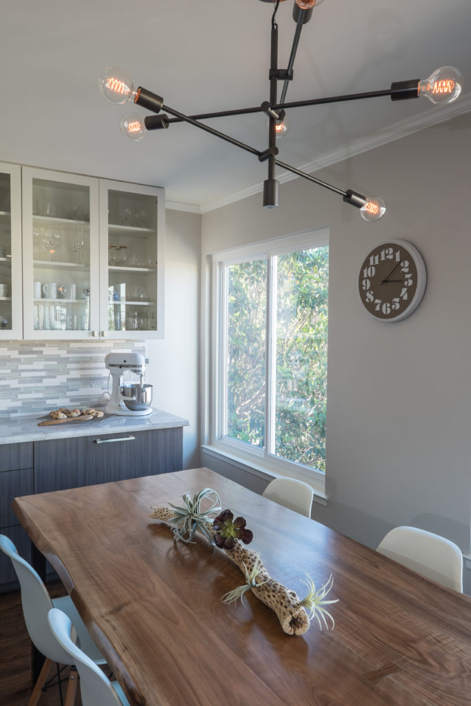
Now for the kitchen; details matter in all rooms, but this is one area I often see additional needs for electrical considerations. For example, let’s say you are planning on subway tile for your backsplash – if you have outlets in your backsplash, then you may want to consider turning them horizontally so they don’t break up the horizontal lines of your new tile layout. Another area to consider is the kitchen island – make sure you have outlets here as well, and consider an outlet / USB combination. This is a common space that quickly turns into a major hub/homework/work zone of the home; you will eventually need to charge your tablet, phone, and laptop and not want to move to do so. Think about the placement of these outlets, however; you don’t want to pay for beautiful cabinets only to have an outlet stuck into the side of it. Strategic placement of outlets for use but out of sight is ideal. Overhead lighting is critical, of course. Kitchen duty work zones such as cooking, prep work, and cleaning require adequate lighting – pay attention to where they are placed and how many you have.
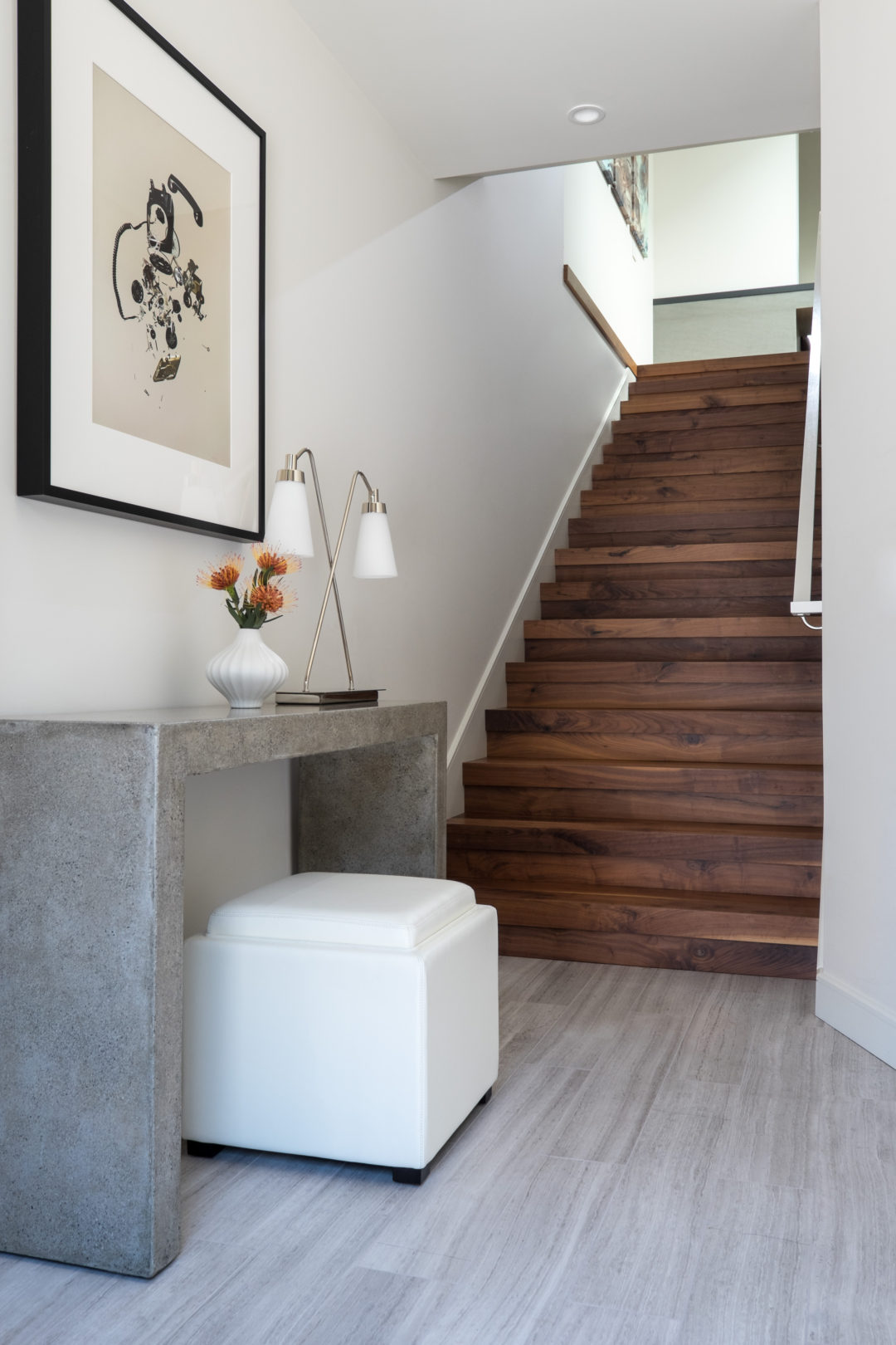
Hallways need attention, too. Make sure you have enough overhead lighting, but adjust the eye of the light to face toward the walls to visually push the walls out and make a hallway appear larger than it is. The other reason to pay attention to lighting in the hallway is artwork. There is no use putting that beloved framed piece you picked up on vacation up if nobody can see it because your hallway is dark. Overhead lighting is not your only option for a hallway; if the width of the hall allows, consider a combination of overhead and sconces — placed on separate switches, –so you can adjust the light to your liking.
Want help with your remodel or design project? Contact us to discuss your project. No matter the size, we want to hear from you.
I hope you enjoyed these manicured design tips.

