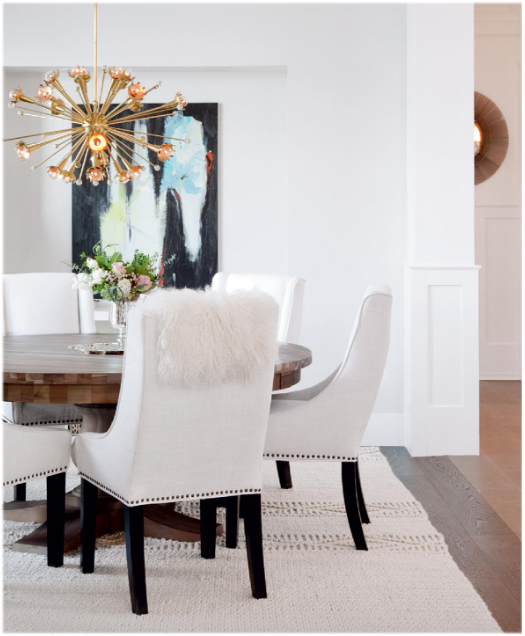
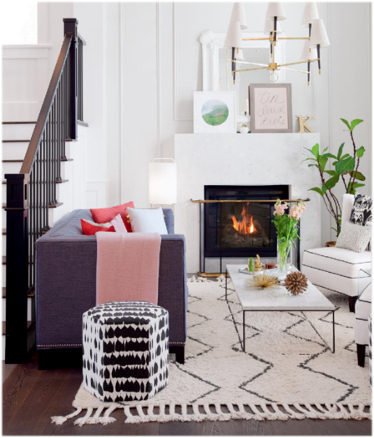
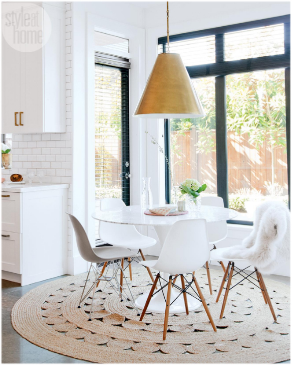
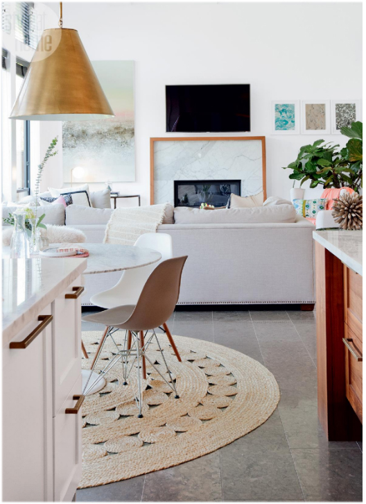
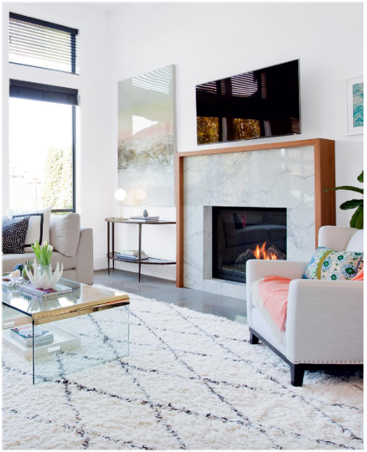
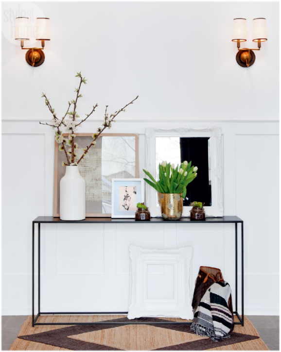
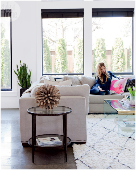
As a new homeowner and an Interior Designer, I have a million projects in my mind at once — some that keep me up and night giddy with excitement of seeing the design come to life. It’s why I do what I do -I love it! What I don’t love is keeping to a decision that Brad and I made that is proving to be extremely tough, despite knowing it’s the right thing to do. That decision? It’s to live in our house for one year prior to any major remodel. As a designer, I’m exposed to hundreds of finishes, furniture of all styles, and detail after detail. This home tour is one that resonates so deeply with me. Every corner of this home makes me rethink any plans I had – which is probably why we made the decision in the first place — and reminds me that I have to feel out our home first. Gorgeous millwork, warm wood tones, light walls, metallic and black accents, complete with a to-die-for kitchen. I’m taking notes and replaying this home again and again. The kitchen, with its floor to ceiling glass cabinets that extend the eye, provide storage for showcase pieces, and mixed with the subway tile make it feel anything but untouchable. The luxe look of the kitchen, complete with the heavy wood island, allows for long conversations and entertaining – a must on my list!
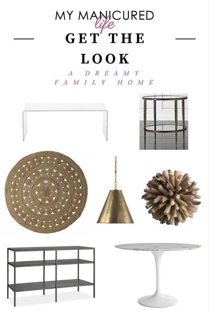
With so many gorgeous elements that make up this home, be sure to find my “Get The Look” at the bottom of this post!
Get The Look: Coffee table //Accent Table // Area Rug // Brass Pendants //Wood Sphere // Entry Table // Kitchen Table
Photos: Via

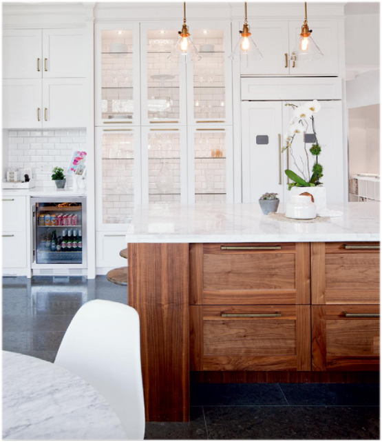
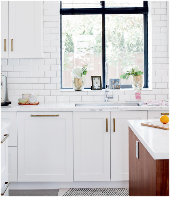
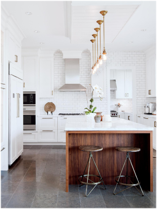


What color grout was used in the kitchen? Love the shade! This house is stunning!
Hi Stevie!
If I had to guess, it would be color, Platinum. If you are going for something similar, look for that of a warm grey. Remember, the darker you go the more the lines will become a feature. Hope that helps!