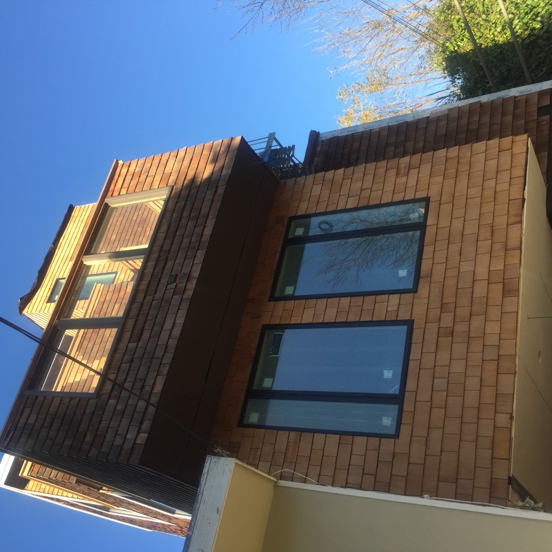
I want to give you a little peek into a project I’m working on here in San Francisco. If you already follow me on Instagram, you have seen a few pictures of the four-story home I’ve titled the #SFTreeHouseProject. This project epitomizes SF living, where limited land pushes homes into the sky. The first three stories on the north side face lush trees while the south side and the top level feature views that evoke San Francisco dreams.
I’ll start breaking down this project level by level over a few posts, so stay with me! This home is located in the Cow Hollow district of San Francisco, a family-friendly neighborhood walking distance to wonderful restaurants and shops.
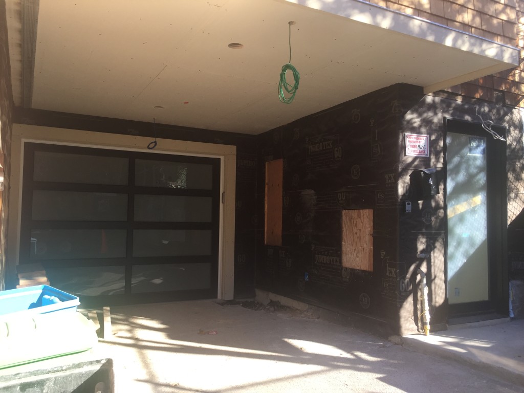
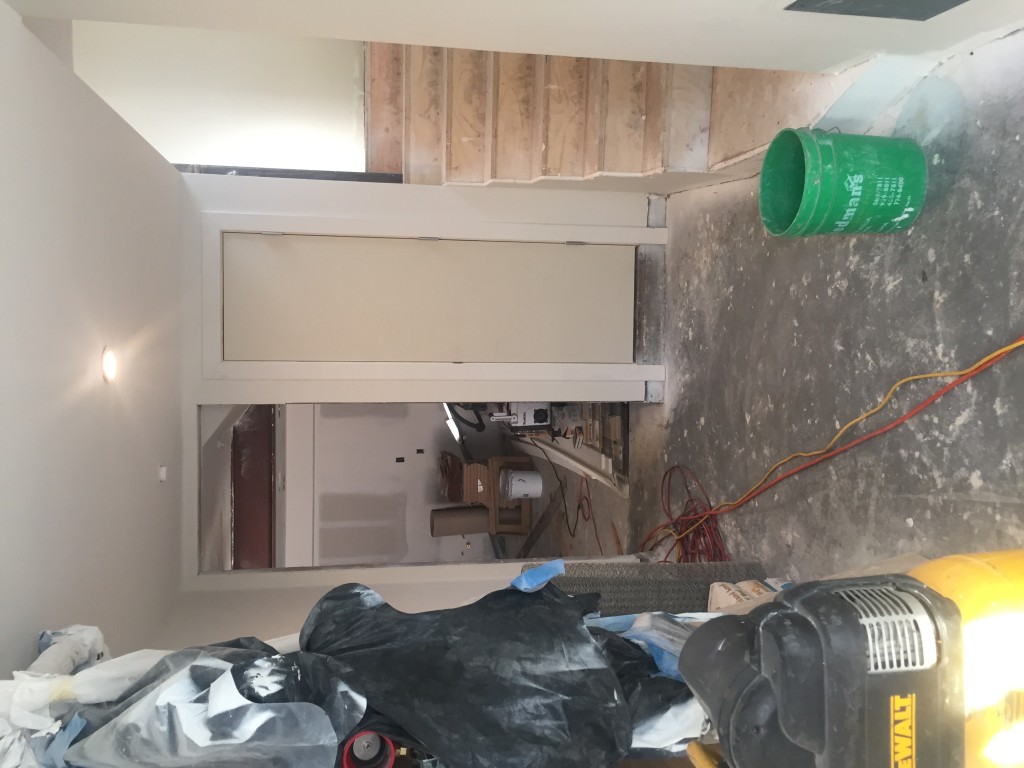
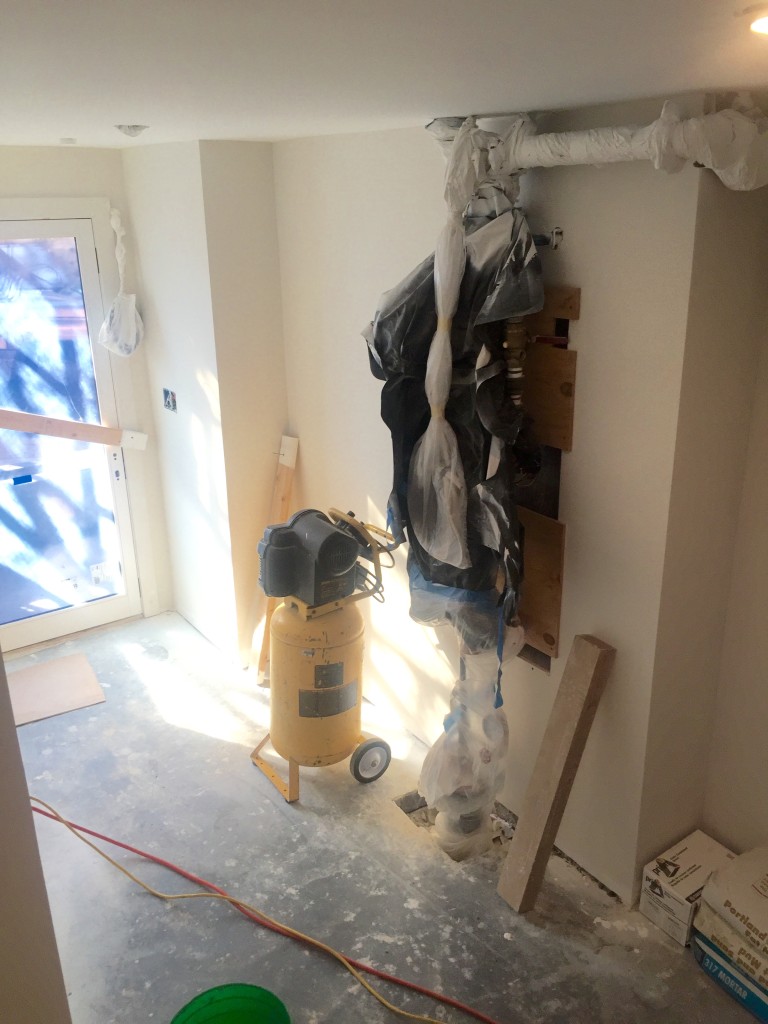
The entry is long and narrow with a slight curve, a door to the garage on one end, and a small coat closet. Exposed piping and stairs take you to the three levels above. While the rest of the home has high ceilings, this room has a standard 8′ ceiling height. Any entry should be taken into consideration rather than bypassing it. In this case, the entry of the home and the garage are the only two spaces on the first floor. This space provides the first impression upon entering the home. Whether due to picking up the kids or dropping off packages, many guests will never make it past this space, so it needed to be impactful and practical for the family.
Before Photos
View from the front door into the entry.
View looking down into the space from the stairs.
The Plan
Like any project, the client and I discussed their needs versus wants for the entry. The two categories broke down like this:
Needs: Storage, seating, and lighting
Wants: Color, texture, visual interest, and a drop zone for keys, mail, etc.
The Design
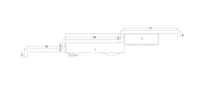
Working with the angles of the entry, we came up with a built-in cabinet design that provides storage, color, and even texture!
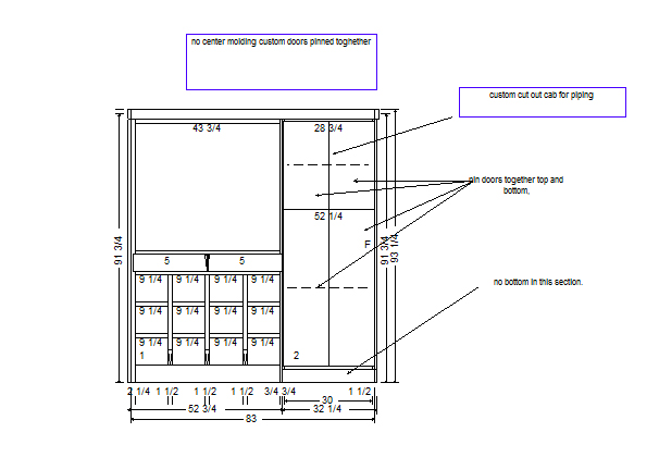
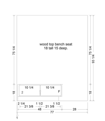
If you were to enter the home from the front door, the cabinetry would be on the left-hand side. Let’s discuss item #1 and item #2, (numbers shown in the cabinets) and break them down.
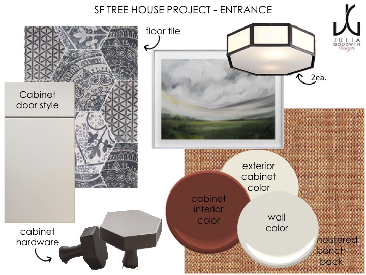
When entering the home from the outside, these custom built-in cabinets will be on the left-hand side. The slab front doors will be painted in Swiss Coffee OC-45 (my favorite warm white), and back panels to be painted in Tea 2091-10 (a rich burnt orange), both by Benjamin Moore. The cabinets include cubbies for the kids’ shoes, two drawers below a large alcove for small items, and door fronts that enclose piping yet still provide access when needed.
With two pull out drawers, each child has their own drawer where they can store day-to-day items needed when heading out the door. The bench will receive an upholstered zip-off cushion in a durable, solid faux velvet in burnt orange. We will also place an upholstered back that reaches the height of the ceiling in a warm textured print, framed out in the same painted wood as the built-in cabinet.
The hexagon floor is a great way to add impact without overwhelming the space, with the hexagon shape repeated in the lighting and hardware. With slab front doors in the cabinetry design, acts as a simple yet clean backdrop. The upholstered bench and back panel bring color around the corner and provide the perfect spot for the children to take on / off shoes and to pack up their bags.
Inside the alcove, above the two small drawers, a mirror, a shallow bowl, and a trinket or two will be added to finish off the look!
While it’s the first impression of the home, it will actually be among the last items installed as there is a lot of traffic going in and out of the house during construction!
Please stay tuned for the after photos that won’t be too long, as flooring will go in this week!
If you are interested in hiring Julia Goodwin Design to help you with your design project, please contact me here. I look forward to hearing from you!

